UI / UX Design
Designing a Smarter Dashboard for FedEx Users
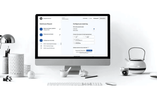
A complete UX overhaul of FedEx’s logged-in homepage — improving shipment visibility, simplifying navigation, and boosting user engagement across millions of active accounts.
Year :
2022-24
Industry :
Logistics
Client :
FedEx
Project Duration :
24 months
🧩 1. Problem
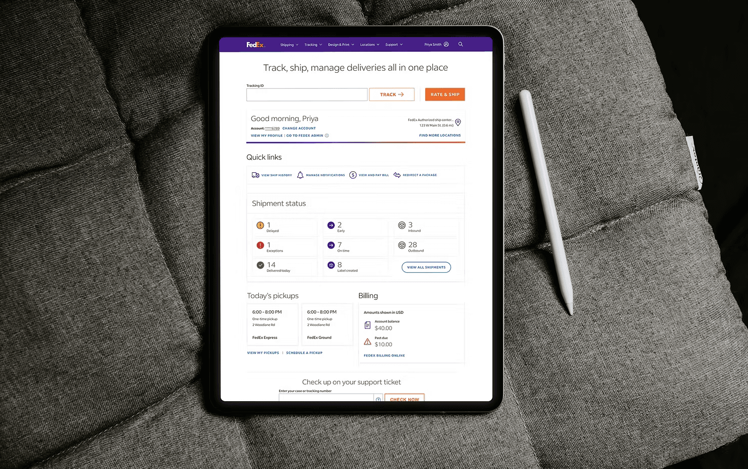
When FedEx approached us at Wipro, their logged-in homepage dashboard (called Control Center) was:
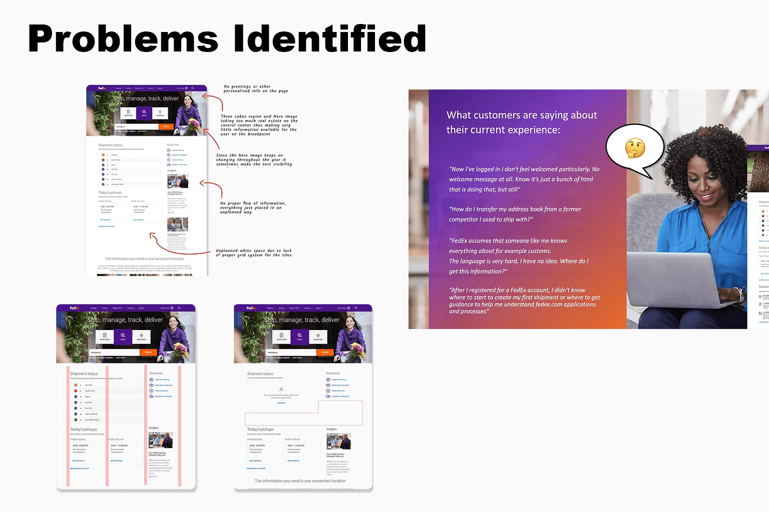
Too cluttered — It had multiple widgets with no clear hierarchy.
Hard to use — Users struggled to find the most important shipment, billing, and pick-up information.
Not scalable — As FedEx kept adding new features (like sustainability stats), the layout got messier.
Frustrating for users — Power users like shipping managers and logistics teams had to dig through different screens to complete simple tasks.
As a UX Designer, I noticed:
Users had repetitive workflows that needed shortcuts or summaries.
Business stakeholders wanted to promote new tools and features, but there was no clear space for it.
There was no unified design system, making it hard to stay consistent across updates.
Impact on FedEx:
Drop in user satisfaction
Increase in support tickets
Difficulty onboarding new users to Control Center
💡 2. Solution
Our goal was to create a single, powerful, user-friendly dashboard — a true Control Center that meets both user goalsand FedEx business needs.
As the UX Designer, I led the redesign by focusing on:
🔍 Understanding Users
Interviewed internal power users (e.g. logistics officers, admin teams)
Mapped common tasks: track shipments, view invoices, schedule pickups, check sustainability data
Identified pain points and prioritized features based on frequency and urgency
🖥 Designing the Experience
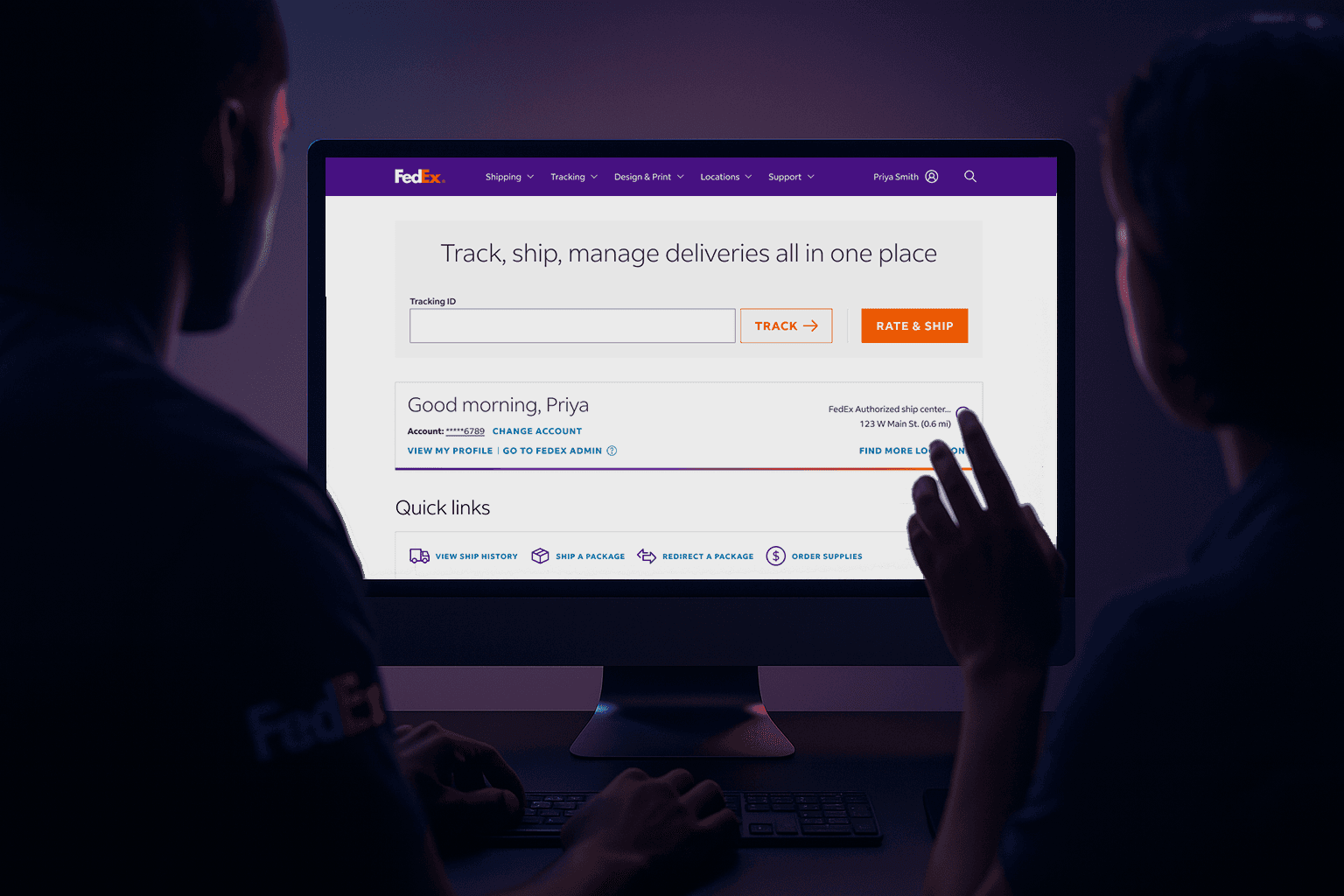
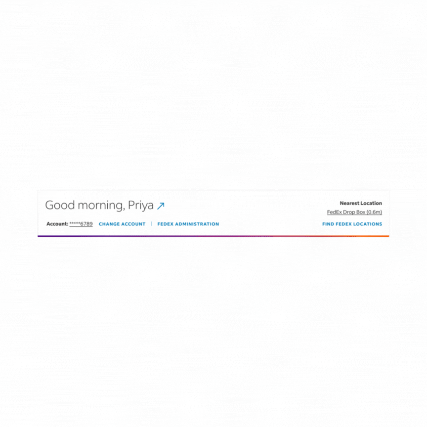
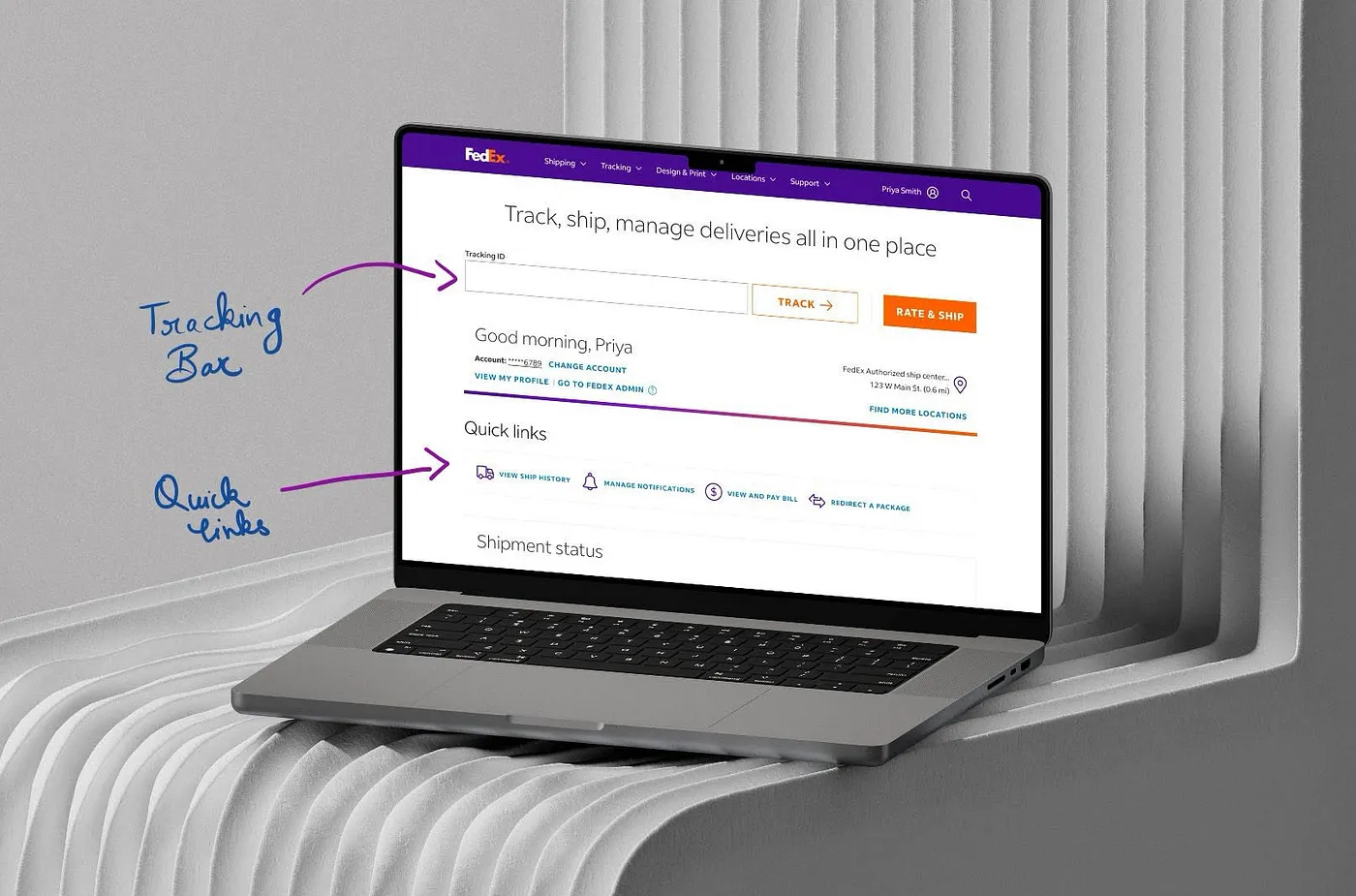
Created modular dashboard widgets that show shipment summary, billing info, and key actions in one place
Used progressive disclosure — show essentials first, then allow drill-downs
Added a Quick Links tile with user-personalized shortcuts (based on usage patterns)
Designed the new Sustainability Widget to showcase FedEx’s green efforts in a visually engaging way
📐 Building a Scalable System
Developed a Design System to standardize typography, spacing, components, and icon usage
Ensured the design worked across different screen sizes and was accessible (WCAG-compliant)
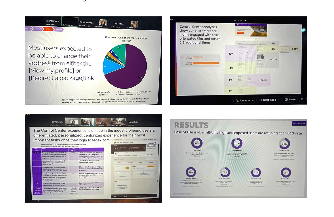
📊 Testing and Iteration
Ran multiple usability tests with FedEx teams
Measured success via heatmaps, click tracking, and feedback
Continuously improved based on real-world use cases
🚧 3. Challenges
🧠 Balancing User Needs vs Business Goals
Users wanted simplicity, while the business wanted feature discoverability
Solution: I designed a system that surfaced important features contextually without overwhelming the user
🏗 Handling Complex, Live Data
Shipment and billing info changed constantly and needed real-time updates
I worked closely with developers to make sure the dashboard performed fast and didn’t break with volume
🤝 Long-term Collaboration
The project spanned over 2+ years
I coordinated across multiple teams: product owners, developers, QA testers, business analysts, and FedEx stakeholders
Maintained consistent quality and design integrity through multiple rollouts
✅ 4. Summary
Over two years, I helped transform the FedEx Control Center from a cluttered homepage into a powerful, user-focused dashboard that:
Helped users complete tasks faster
Boosted engagement and satisfaction
Reduced support tickets and confusion
Supported FedEx’s business goals around discoverability, branding, and sustainability
As a UX Designer at Wipro, I focused not just on making the product usable — but on making it valuable to both the end users and the business. The result was a scalable, future-ready dashboard that’s used by thousands of FedEx customers every day.
More Projects
UI / UX Design
Designing a Smarter Dashboard for FedEx Users
A complete UX overhaul of FedEx’s logged-in homepage — improving shipment visibility, simplifying navigation, and boosting user engagement across millions of active accounts.
Year :
2022-24
Industry :
Logistics
Client :
FedEx
Project Duration :
24 months
🧩 1. Problem
When FedEx approached us at Wipro, their logged-in homepage dashboard (called Control Center) was:
Too cluttered — It had multiple widgets with no clear hierarchy.
Hard to use — Users struggled to find the most important shipment, billing, and pick-up information.
Not scalable — As FedEx kept adding new features (like sustainability stats), the layout got messier.
Frustrating for users — Power users like shipping managers and logistics teams had to dig through different screens to complete simple tasks.
As a UX Designer, I noticed:
Users had repetitive workflows that needed shortcuts or summaries.
Business stakeholders wanted to promote new tools and features, but there was no clear space for it.
There was no unified design system, making it hard to stay consistent across updates.
Impact on FedEx:
Drop in user satisfaction
Increase in support tickets
Difficulty onboarding new users to Control Center
💡 2. Solution
Our goal was to create a single, powerful, user-friendly dashboard — a true Control Center that meets both user goalsand FedEx business needs.
As the UX Designer, I led the redesign by focusing on:
🔍 Understanding Users
Interviewed internal power users (e.g. logistics officers, admin teams)
Mapped common tasks: track shipments, view invoices, schedule pickups, check sustainability data
Identified pain points and prioritized features based on frequency and urgency
🖥 Designing the Experience
Created modular dashboard widgets that show shipment summary, billing info, and key actions in one place
Used progressive disclosure — show essentials first, then allow drill-downs
Added a Quick Links tile with user-personalized shortcuts (based on usage patterns)
Designed the new Sustainability Widget to showcase FedEx’s green efforts in a visually engaging way
📐 Building a Scalable System
Developed a Design System to standardize typography, spacing, components, and icon usage
Ensured the design worked across different screen sizes and was accessible (WCAG-compliant)
📊 Testing and Iteration
Ran multiple usability tests with FedEx teams
Measured success via heatmaps, click tracking, and feedback
Continuously improved based on real-world use cases
🚧 3. Challenges
🧠 Balancing User Needs vs Business Goals
Users wanted simplicity, while the business wanted feature discoverability
Solution: I designed a system that surfaced important features contextually without overwhelming the user
🏗 Handling Complex, Live Data
Shipment and billing info changed constantly and needed real-time updates
I worked closely with developers to make sure the dashboard performed fast and didn’t break with volume
🤝 Long-term Collaboration
The project spanned over 2+ years
I coordinated across multiple teams: product owners, developers, QA testers, business analysts, and FedEx stakeholders
Maintained consistent quality and design integrity through multiple rollouts
✅ 4. Summary
Over two years, I helped transform the FedEx Control Center from a cluttered homepage into a powerful, user-focused dashboard that:
Helped users complete tasks faster
Boosted engagement and satisfaction
Reduced support tickets and confusion
Supported FedEx’s business goals around discoverability, branding, and sustainability
As a UX Designer at Wipro, I focused not just on making the product usable — but on making it valuable to both the end users and the business. The result was a scalable, future-ready dashboard that’s used by thousands of FedEx customers every day.